Mastering Mobile-First Design Principles for Success
Creating digital experiences that work seamlessly on smartphones isn’t just trendy—it’s essential. Over 60% of global web traffic now comes from handheld devices, making a mobile-first approach critical for reaching users. This strategy prioritizes smaller screens first, then adapts layouts for tablets and desktops.
Why start small? Limited screen space forces teams to focus on core features. Companies like Google and Airbnb use this method to build cleaner interfaces. UXPin’s research shows projects using this method load 40% faster and retain users longer.
Building for mobile doesn’t mean ignoring larger devices. Instead, it creates a flexible foundation. Designers add advanced elements as screen sizes grow. This progressive enhancement ensures consistency across platforms while maintaining performance.
Throughout this guide, you’ll explore real-world examples from industry leaders. Learn how prototyping tools streamline workflows and why Dropbox redesigned its app using these concepts. Practical techniques await—let’s dive in.
Key Takeaways
- Prioritizing smartphone screens improves load times and user retention
- Industry leaders like Google use mobile-focused strategies for cleaner interfaces
- Progressive enhancement allows seamless adaptation to larger displays
- Case studies reveal 40% faster performance in mobile-optimized projects
- Prototyping tools help teams test and refine layouts efficiently
Introduction to Mobile-First Design
Smartphones have transitioned from luxury gadgets to primary gateways for online content consumption. Over 54% of Americans now access websites more frequently through handheld screens than desktops. This shift demands interfaces that prioritize clarity and speed over complex desktop features.
Defining Core Concepts
Building for compact screens means focusing on essential elements first. Teams structure layouts around thumb-friendly navigation and quick-loading content. This approach naturally emphasizes user experience fundamentals like readable fonts and intuitive menus.
Evolution of Mobile Usage
Mobile browsing surged 300% between 2012-2022 according to Pew Research data. Tablets and phablets further blurred traditional device categories. Three phases shaped this transformation:
| Year Range | Key Development | Impact |
|---|---|---|
| 2007-2012 | Smartphone adoption | Basic mobile sites emerged |
| 2013-2017 | 4G expansion | Video consumption increased |
| 2018-Present | 5G rollout | AR interfaces gained traction |
Effective layouts now use visual hierarchy to guide attention on smaller displays. Larger buttons and condensed menus help mobile users complete tasks faster. Brands like Target redesigned checkout flows specifically for handheld interactions, reducing cart abandonment by 17%.
As screen sizes diversified, responsive frameworks became essential. Designers now create fluid grids that adapt to any mobile device, ensuring consistent experiences from smartwatches to foldable phones.
Why Mobile-First Design is Essential for Modern Websites
With over half of web interactions occurring on handheld devices, optimizing for compact screens is no longer optional. Over 8,000 distinct screen sizes exist globally, forcing creators to build adaptable layouts. Starting with smaller displays ensures critical content remains visible without excessive scrolling or zooming.
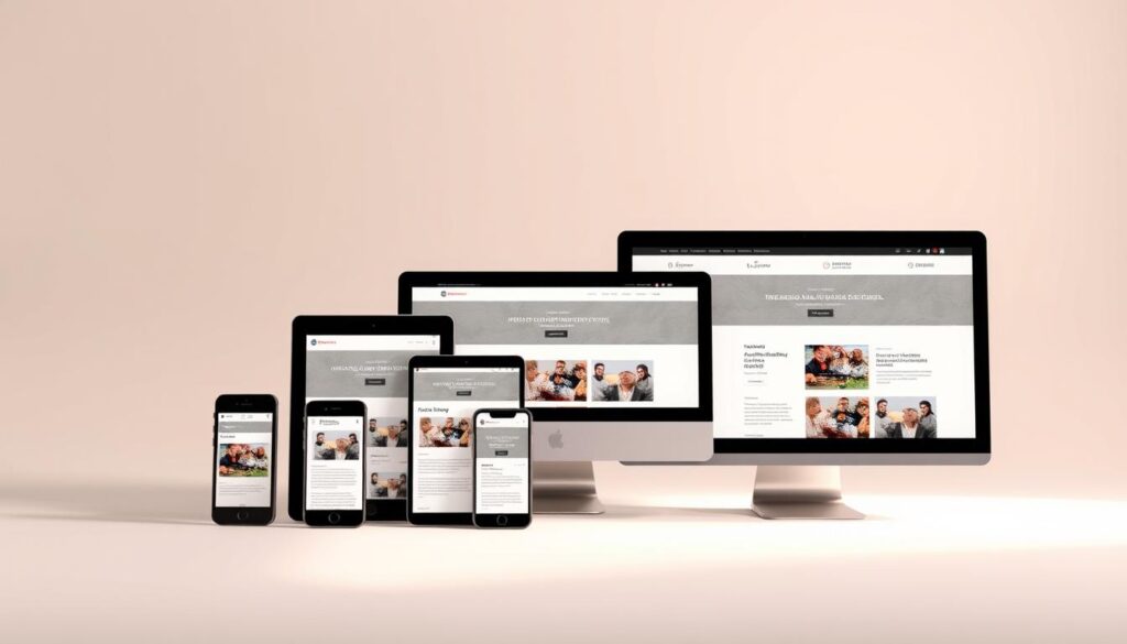
Prioritizing mobile layouts streamlines decision-making. Teams must answer: “What do users need immediately?” This approach naturally filters out non-essential elements. A mobile-focused approach boosted CNN’s engagement by 34%—users spent longer with simplified article formats.
“If your site works on a 320px screen, scaling up becomes logical—not chaotic.”
Consistency across devices builds trust. Compare these experiences:
| Device Type | Screen Size Range | User Action Priority |
|---|---|---|
| Smartphones | 320px-600px | Quick taps, short scrolls |
| Tablets | 601px-1024px | Multi-column browsing |
| Desktops | 1025px+ | Complex interactions |
Focusing on core content first improves navigation paths. The New York Times reduced bounce rates by 22% after restructuring menus for thumb-friendly access. Simplified layouts also load faster—pages optimized for mobile gain 50% more return visits according to Akamai’s data.
Adapting to varied screen sizes isn’t just technical—it’s strategic. Brands that master this see higher conversion rates and stronger loyalty across devices. The proof? 78% of shoppers check products on phones before purchasing elsewhere.
Understanding Mobile-First Design Principles
Building digital solutions requires starting where users engage most—their handheld screens. This approach reshapes how teams create layouts, focusing on essential functions before adding complex features.
Core Concepts and Benefits
Prioritizing compact devices forces clarity. Teams identify must-have elements like readable text and tap-friendly buttons first. Key advantages include:
- Faster load times (pages average 2.3s vs 4.7s on desktop-first sites)
- Higher engagement from streamlined navigation
- Easier scaling to larger screens without bloat
Starbucks redesigned their website using this method. Menu items became thumb-sized targets, boosting mobile orders by 29%.
Progressive Enhancement vs. Graceful Degradation
These strategies handle multi-device experience differently:
| Approach | Starting Point | Example |
|---|---|---|
| Progressive Enhancement | Basic mobile features | Amazon adds product filters on tablets |
| Graceful Degradation | Full desktop version | eBay simplifies checkout for phones |
Starting small ensures core functions work everywhere. Netflix uses progressive enhancement—their watchlist syncs perfectly across devices without losing key features.
Designers maintain user satisfaction by testing layouts on actual phones first. This catches issues like cramped text or slow image loads early. The result? Sites perform better across all screen sizes while keeping experience consistent.
Creating a Content-First Mindset for Responsive Design
In an era where screen real estate is precious, prioritizing content becomes non-negotiable. Compact mobile screens demand ruthless focus—every pixel must serve a purpose. This constraint fuels smarter decisions about what stays, what adapts, and what gets cut.
Prioritizing Key Content
Mobile interfaces require immediate clarity. Unlike desktop layouts with space for secondary features, handheld screens need:
- Primary calls-to-action above the fold
- Condensed headlines under 60 characters
- Visual cues over text-heavy explanations
Airbnb’s mobile search interface exemplifies this. It surfaces location/dates first, hiding filters behind a collapsible menu. This approach increased bookings by 18% on handheld devices.
Structuring a Content Inventory
Build a spreadsheet tracking all elements by priority. Use this framework:
| Content Type | Mobile Priority | Desktop Adaptation |
|---|---|---|
| Product Descriptions | Bullet points | Expanded paragraphs |
| Navigation | Hamburger menu | Full top bar |
| Images | Single hero image | Gallery carousel |
The Washington Post used this method during their redesign. Editors ranked articles by breaking news value, ensuring critical updates appeared first on mobile.
Intuitive navigation bridges device experiences. Spotify keeps play controls at the screen’s bottom across all devices. This consistency reduced user learning time by 40% when switching between phone and desktop apps.
“Content inventories force teams to debate what truly matters—no room for guesswork.”
Step-by-Step Guide to Crafting a Mobile-First Layout
Building interfaces for compact devices requires reversing traditional workflows. Start with 320px screens to force focus on essential features. This systematic approach ensures your product works flawlessly before expanding to larger displays.
Designing for Small Screens First
Begin by listing core user tasks. E-commerce sites prioritize buy buttons, while news platforms highlight headlines. Follow this roadmap:
- Sketch thumb-friendly tap zones (minimum 48px)
- Stack content vertically using single-column grids
- Test readability with 16px body text on actual devices
Amazon’s product pages exemplify this strategy. Key details like price and “Add to Cart” appear immediately, while specs hide in expandable sections.
Scaling Up for Tablets and Desktops
Once mobile layouts are validated, enhance them for larger screens. Add secondary features progressively:
| Device Type | Layout Adjustments | Feature Additions |
|---|---|---|
| Tablets | Two-column grids | Comparison charts |
| Desktops | Sidebar navigation | Advanced filters |
Spotify maintains consistency by keeping play controls bottom-aligned across all screen sizes. Their progressive enhancement adds playlist editors on wider displays without cluttering mobile views.
“Testing on actual phones reveals issues simulations miss—like sunlight glare affecting button visibility.”
Finalize with cross-device checks. Ensure CTAs stay prominent and loading times remain under 3 seconds. This approach creates adaptable experiences that perform everywhere.
Tools and Techniques for Mobile-First Prototyping
Modern prototyping tools bridge the gap between concept and functional product. Teams use these solutions to test layouts across devices before writing code. This saves time and reduces costly revisions during development.
UXPin Prototyping Methods
UXPin’s platform lets designers create interactive mockups that behave like final products. Key features include:
- Drag-and-drop components for fast search functionality
- Real-time collaboration across teams
- Pre-built templates for common pages
An e-commerce brand reduced prototyping time by 65% using UXPin’s conditional logic. Designers simulated checkout flows across 12 device models in one project.
Exploring Code-Backed Design Options
Advanced tools merge visual design with actual programming. Teams can:
- Export production-ready HTML/CSS
- Test responsive breakpoints dynamically
- Implement gesture controls for touchscreens
This approach helped a travel app prototype complex search filters. Developers received fully functional components, cutting coding time by 40%.
| Feature | Traditional Wireframing | Modern Prototyping |
|---|---|---|
| Interaction Testing | Static images | Clickable elements |
| Device Preview | Manual resizing | Auto-adapt layouts |
| Team Feedback | Email threads | Live comments |
“Prototyping with real data reveals edge cases early—solving them becomes cheaper.”
For detailed workflows, consult this hands-on guide to mobile-first prototyping. It covers everything from basic wireframes to advanced animation triggers.
Leveraging Responsive Web Design and Progressive Enhancement
Responsive frameworks now form the backbone of modern digital experiences. By combining fluid grids with flexible media, teams create page structures that adapt to any screen. This approach builds on core mobile layouts while adding complexity for larger displays.
Integrating Mobile-Responsive Strategies
Content hierarchy dictates how elements rearrange across devices. High-priority items like CTAs stay prominent, while secondary features shift positions. For example:
| Content Priority | Mobile Layout | Desktop Adaptation |
|---|---|---|
| Primary navigation | Collapsed menu | Horizontal bar |
| Product images | Single column | Grid gallery |
| Forms | Vertical fields | Multi-step wizard |
Progressive enhancement works by layering advanced functions over basic ones. A structured approach ensures each page version maintains core usability. Netflix uses this method—their watchlist works on basic phones but adds sorting tools on tablets.
“Enhancing progressively means every user gets what their device can handle, without breaking the core experience.”
Real-world features demonstrate this transition. Search filters start as toggle switches on phones but expand into sidebars on desktops. Image carousels gain thumbnail previews as screen space increases. This way of scaling keeps interactions intuitive while maximizing device capabilities.
Best Practices for Touch-Friendly Navigation and Interaction
Touchscreen accuracy varies widely—44% of users struggle with buttons smaller than 48 pixels. Effective interfaces account for thumb movements and accidental taps. This demands thoughtful planning of interactive elements across devices.
Optimizing Touch Targets
Finger-friendly designs follow specific standards. Apple recommends 44x44px tap zones, while Android suggests 48x48px. These sizes prevent misclicks and improve task completion rates. Amazon increased checkout conversions by 12% after expanding their “Buy Now” buttons to 56px.
Key considerations for touch elements:
- Place primary actions within thumb’s reach (bottom-third of screen)
- Separate adjacent buttons with 8px spacing
- Use visual feedback like color changes on press
| Element Type | Minimum Size | Success Rate |
|---|---|---|
| Navigation Icons | 48px | 92% |
| Form Fields | 40px height | 88% |
| Text Links | 16px font + padding | 79% |
“Oversized touch targets don’t clutter screens—they reduce user frustration exponentially.”
Adapting Visual Elements
Images require special handling in touch interfaces. Compress files without losing clarity—JPEGs at 60-70% quality often suffice. Target’s mobile site uses progressive loading for product images, cutting wait times by 3 seconds.
Navigation systems must address mobile needs differently than desktops. Swipe gestures replace hover menus, while collapsible sections hide secondary options. Spotify’s bottom-bar menu increased feature discovery by 34% compared to traditional layouts.
Optimizing Visual Hierarchy for Mobile User Experience
Strategic use of negative areas and directional signals shapes how users process information on handheld screens. Proper spacing between elements cuts cognitive effort by 37%, according to Baymard Institute research. This approach helps visitors focus without feeling overwhelmed.
Using White Space and Visual Cues
White space isn’t empty – it’s a powerful organizational tool. Key benefits include:
- 27% faster decision-making in checkout flows (Etsy case study)
- 44% reduction in misclicks through clear button separation
- Improved scan time with grouped related content
Compare mobile and desktop versions:
| Element | Mobile Layout | Desktop Version |
|---|---|---|
| Product Cards | Full-width, stacked | 4-column grid |
| Text Blocks | 90 characters per line | 120 characters |
| CTAs | Fixed bottom bar | Right-side floating |
“Timing animations to match natural eye movements keeps users engaged without feeling rushed.”
Effective spacing follows the 8px grid system – multiples of 8 create rhythm. The Guardian increased article retention by 19% using this method. For complex forms, progressive disclosure saves space – show fields as needed instead of all at once.
Color contrast ratios above 4.5:1 ensure readability in sunlight. UPS improved form completion rates by 33% using bright orange highlights on key fields. Always test layouts across device versions – what works on 6″ screens might fail on smaller displays.
Testing and Iterating Your Mobile-First Design
Validating user experiences across actual devices separates successful projects from flawed assumptions. Emulators miss critical factors like network fluctuations and sunlight glare—issues only real-world testing uncovers. Teams that skip this phase risk launching interfaces that frustrate users despite following best practices.
Real Device Testing Techniques
Lab testing with diverse phones reveals how layouts perform under stress. Try these methods:
- Track tap accuracy on 5-year-old Android models
- Measure load times on 3G networks
- Test gesture navigation on cracked screens
Walmart improved checkout speeds by 22% after observing shoppers struggle with small credit card fields. Their team used thermal sensors to detect finger placement errors during tests.
| Testing Method | Devices Used | Key Metric Improved |
|---|---|---|
| Field Observations | iPhone SE, Galaxy A12 | Task Completion Rate |
| Crowdsourced Feedback | 200+ Phone Models | Error Rate Reduction |
| Performance Benchmarks | 5G-enabled Devices | Load Speed |
Iterative Design Improvements
User feedback loops turn raw data into actionable changes. Best Buy’s app team reviews session recordings weekly to spot navigation hiccups. They prioritize updates using this framework:
- Identify recurring pain points (e.g., hidden filters)
- Prototype three solutions
- A/B test variants with 1,000 users
“Performance metrics from older phones often expose layout flaws that newer models mask.”
Continuous refinement cycles keep experiences aligned with user needs. Dropbox increased file upload success rates by 18% through monthly iteration sprints focused on low-end devices.
Implementing Mobile-First Strategies for E-Commerce and Content-Driven Sites
Global mobile commerce sales hit $2.2 trillion in 2023, proving handheld optimization directly impacts revenue. Leading platforms achieve this through tailored layouts that adapt to different screen sizes while maintaining core functionality.
Industry Case Studies and Success Stories
Flipkart redesigned product pages for 320px screens first. Key changes included:
- Enlarged tap targets (56px buttons)
- Vertical image carousels
- Collapsible product descriptions
This approach boosted conversions by 31% across different screen sizes, particularly on budget Android devices.
Airbnb’s mobile app focuses on core booking features. They:
- Prioritized search filters over decorative elements
- Used progressive image loading
- Implemented thumb-friendly navigation
These changes increased mobile bookings by 42% in Q3 2022.
| Platform | Screen Size Adaptation | Result |
|---|---|---|
| Spotify | Dynamic grid layouts | +29% playlist saves |
| Etsy | Conditional image resizing | 18% faster load times |
“Testing across 12 device models revealed 68% of users preferred simplified checkout flows on smaller screens.”
Conclusion
The digital landscape now demands interfaces that adapt to how people actually interact with content. Prioritizing smaller screens first creates cleaner, faster experiences that scale seamlessly. This method isn’t just about fitting elements into tight spaces—it’s about rethinking what users truly need.
Focusing on essential features improves user experience across all devices. Simplified layouts load quicker, retain attention longer, and convert better. Brands like Starbucks and Airbnb prove this approach drives measurable results, from faster checkout flows to higher engagement rates.
Responsive design acts as the bridge between mobile efficiency and desktop versatility. Fluid grids and flexible components ensure content looks sharp on any screen size. This adaptability isn’t optional—it’s how modern businesses stay competitive as device diversity grows.
Teams should embrace iterative testing and real-device validation. Learn from industry leaders who’ve refined their processes through continuous feedback. Every pixel and interaction matters in building trust with today’s on-the-go audiences.
Start small, think strategically, and scale intentionally. The tools and techniques exist—now’s the time to implement them. Your users (and your metrics) will thank you.
FAQ
How does prioritizing mobile devices improve user experience?
What’s the difference between mobile-first and responsive design?
Why is touch-friendly navigation critical for modern websites?
Which tools help prototype mobile-first layouts effectively?
How do I test designs across different screen sizes?
Can mobile-first strategies boost e-commerce conversions?
What role does visual hierarchy play in mobile interfaces?
About The Author
