Fixing Mobile Usability Errors in Search Console
Ensuring your website works smoothly on smartphones isn’t just optional—it’s essential. Over 60% of online traffic comes from handheld devices, and Google prioritizes sites optimized for smaller screens. When technical glitches disrupt this experience, they appear as alerts in your Search Console dashboard. Ignoring these warnings can hurt rankings and frustrate visitors.
This guide simplifies the process of identifying and resolving these problems. You’ll learn how to use Google’s updated tools to validate fixes and monitor progress. The latest Search Console features, like automatic reindexing, make it easier than ever to maintain compatibility across devices.
Why does this matter? Pages that load quickly and display correctly on phones often rank higher in Google Search. They also keep users engaged longer, reducing bounce rates. We’ll walk through real examples, from viewport misconfigurations to touch element spacing, using insights directly from Google’s documentation.
For those tackling these challenges, our step-by-step troubleshooting guide provides actionable solutions. Whether you’re a developer or a site owner, mastering these skills ensures your content stays visible and functional in today’s mobile-first world.
Key Takeaways
- Mobile compatibility directly impacts search rankings and user engagement.
- Google’s updated tools allow faster validation of technical fixes.
- Common issues include improper viewport settings and cramped clickable elements.
- Regular audits prevent minor errors from becoming major traffic blockers.
- Responsive design reduces recurring compatibility problems.
Understanding Mobile Usability and Its Challenges
Smartphones now dominate how people access online content. Websites not optimized for handheld screens risk frustrating visitors and losing visibility. Technical flaws in design often create barriers that Google Search Console detects as critical problems.
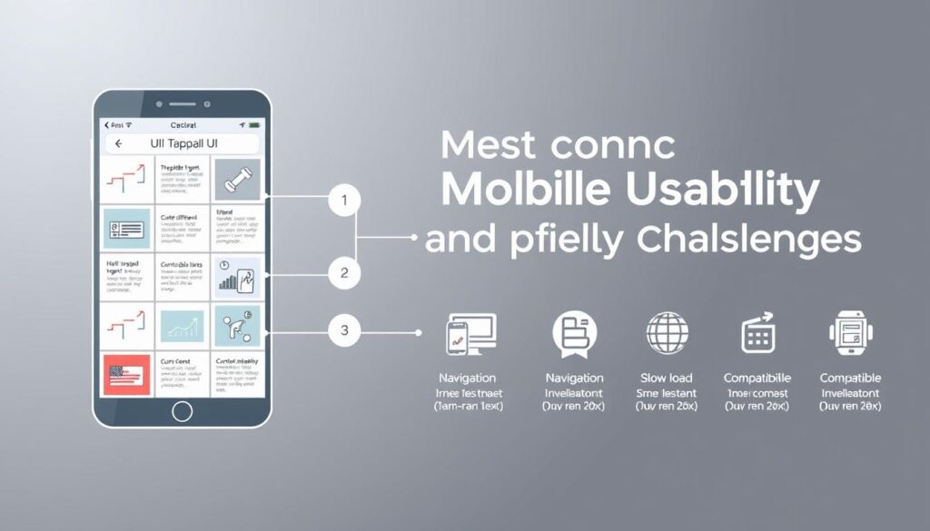
Common Mobile Usability Issues
Three problems frequently appear in reports:
- Text shrinking to unreadable sizes on smaller displays
- Buttons or links crammed too tightly for accurate tapping
- Content overflowing screen widths, forcing horizontal scrolling
These “elements close together” warnings highlight layouts that hinder smooth interactions. Google’s updated dashboard categorizes them clearly, helping teams prioritize fixes.
Impact on SEO and User Experience
Pages with these flaws often see bounce rates spike by 40% or more. Visitors leave quickly when navigation feels awkward. Search engines interpret this behavior as low-quality content, dropping rankings over time.
Regular audits using site analysis tools prevent minor issues from escalating. Quick corrections maintain engagement and preserve organic traffic. As Google phases out legacy tools, their newer platforms streamline monitoring for persistent layout challenges.
Diagnosing Issues in Google Search Console
Accurate diagnosis is the cornerstone of resolving technical website problems. Google’s dashboard provides precise tools to pinpoint layout flaws affecting handheld devices.

Navigating the Mobile Usability Report
Access the report under the “Enhancements” menu in Search Console. Click any flagged row to reveal affected URLs and visual examples. The “Details” column shows specific trouble spots like improperly spaced buttons.
“Always test changes immediately using the Live Page tool before validation. This prevents wasted time on incomplete fixes.”
Interpreting Error Messages and Examples
Google categorizes problems by severity and frequency. A common alert—“elements close together”—often stems from CSS padding gaps. Compare the dashboard’s screenshots with your live page to confirm discrepancies.
| Error Type | Typical Cause | Test Result |
|---|---|---|
| Content Wider Than Screen | Missing viewport meta tag | Horizontal scrollbar appears |
| Unreadable Text | Fixed font sizes | Zoom required |
| Touch Targets Too Close | Insufficient button spacing | Accidental clicks |
Handling Validation and Reindexing Requests
After adjustments, click ‘Validate Fix’ to trigger Google’s recrawl. Most corrections take 72 hours to reflect. For persistent flags, review our compatibility troubleshooting guide to address caching delays or conflicting plugins.
How to Fix Mobile Usability Errors in Search Console
Addressing technical glitches requires a methodical approach. Start by isolating problematic pages through Google’s diagnostic tools, then verify adjustments using real-world testing methods.
Step-by-Step Troubleshooting Process
First, export the list of flagged URLs from Search Console. Sort them by error type—“text small” and “close together” often share similar solutions. For Squarespace users, platform-specific solutions streamline this phase.
Using the Live Mobile-Friendly Test Tool
Google’s interactive checker provides instant feedback. Paste your URL to see how real devices render your page. The tool highlights:
- Font sizes needing relative units (rem/%) instead of fixed px values
- Navigation elements requiring 48px spacing
- Overflowing content requiring CSS containment
Implementing Code and Layout Adjustments
Modify viewport settings and media queries for responsive scaling. Increase padding between interactive elements using CSS. Test all changes across multiple screen sizes before validation.
| Common Fix | Code Example | Result |
|---|---|---|
| Text Scaling | font-size: 1.2rem | Readable on all devices |
| Button Spacing | padding: 12px 24px | Accurate taps |
| Viewport Correction | meta name=”viewport” | Proper alignment |
After deploying fixes, click ‘Validate Fix’ in Search Console. If errors persist despite corrections, clear cached versions and resubmit. Google’s systems occasionally require multiple validation attempts for complex websites.
Conclusion
Maintaining a seamless experience across devices remains critical as user expectations evolve. This guide outlined practical strategies to identify layout flaws, adjust code, and validate improvements through Google’s tools. Pages optimized for readability and interaction see better engagement—key for boosting organic results.
Regularly reviewing your site’s performance helps catch recurring issues early. Use the platform’s diagnostic reports to track progress and refine layouts. Addressing spacing or sizing before they escalate reduces long-term maintenance work.
Proactive monitoring ensures the number of high-quality pages grows steadily. Combine automated checks with manual testing for reliable outcomes. For detailed solutions, consult our step-by-step guide to streamline troubleshooting.
Stay ahead by treating compatibility as an ongoing process—not a one-time fix. Consistent audits and swift corrections keep visitors satisfied while signaling value to search algorithms. Start today: refine your approach, measure improvements, and watch performance climb.
FAQ
Why do elements appear too close on mobile screens?
How can I check if my text is too small for mobile users?
What does “validate fix” mean in Search Console?
How often should I check the Mobile Usability report?
Can plugins cause mobile layout issues?
What happens if I ignore mobile usability warnings?
About The Author
